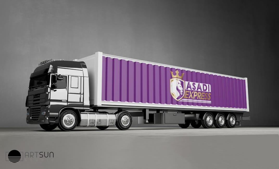
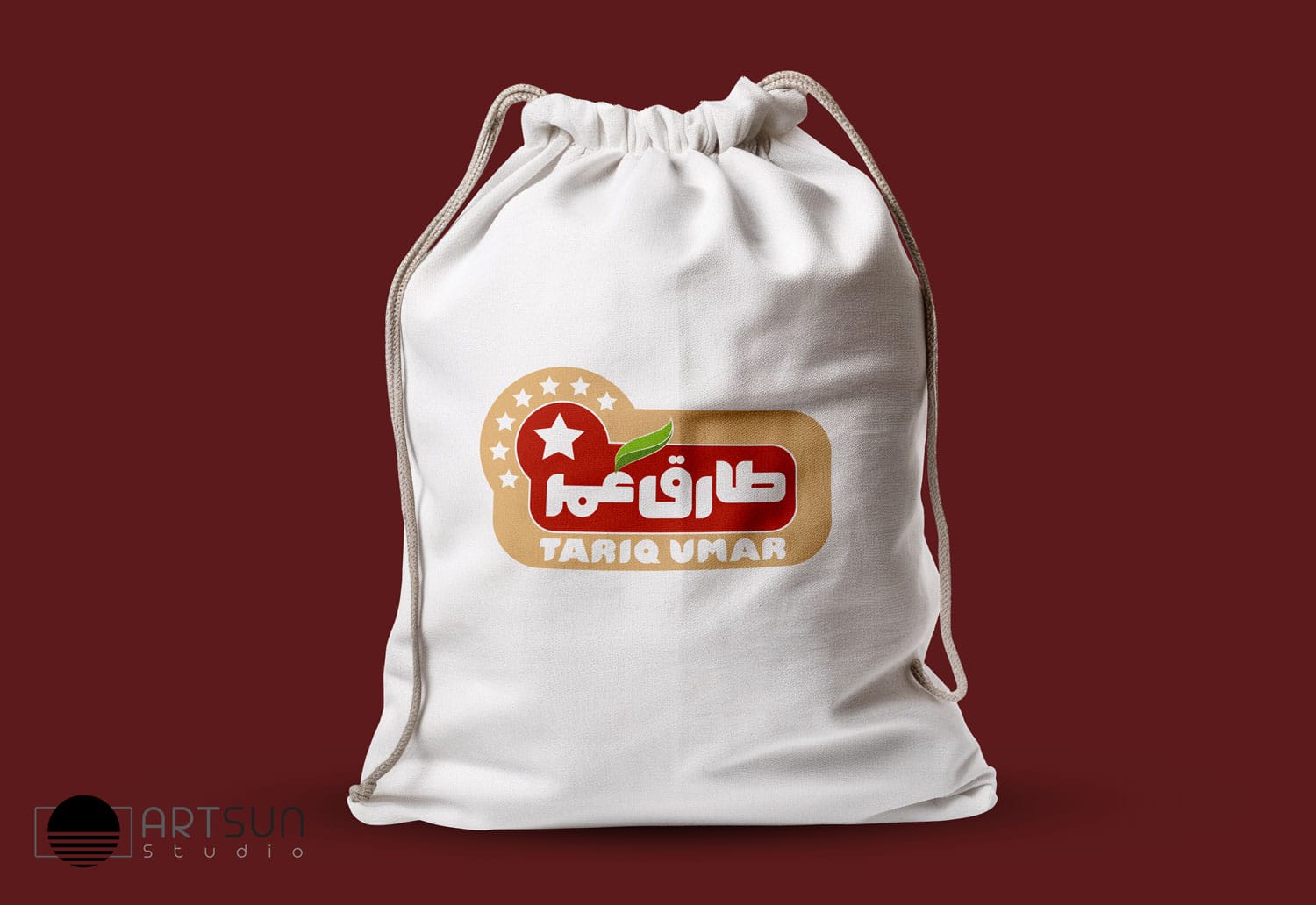
Logo Design Services by Artsun
A logo design is more than just a symbol; it’s the face of your brand, a visual representation that communicates your identity, values, and story. At Artsun studio, we specialize in crafting unique, memorable logos that set your business apart and leave a lasting impression.
Why Is a Professional Logo Important?
A professionally designed logo is an essential asset for your brand. It:
- Establishes Brand Identity: Acts as the cornerstone of your visual identity.
- Builds Trust: A high-quality logo conveys professionalism and credibility.
- Enhances Recognition: Helps your audience recognize and remember your brand.
- Supports Marketing Efforts: A great logo makes your brand more marketable across platforms.
Our Logo Design Services
At Artsun, we understand that every business is unique. That’s why we offer custom logo design services tailored to reflect your brand’s personality. Our services include:
- Concept Development: Crafting unique logo ideas based on your business goals and industry trends.
- Custom Design: Designing logos from scratch to ensure originality.
- Rebranding: Revitalizing your existing logo to align with your evolving brand identity.
- Typography and Icon Design: Selecting the perfect font and creating distinctive icons to complement your brand.
Our Process
- Initial Consultation: We start by understanding your brand, target audience, and design preferences.
- Brainstorming and Research: Our team explores ideas and trends to develop a creative direction.
- Concept Presentation: We provide multiple logo concepts for your review.
- Feedback and Revisions: Incorporating your input to refine the design.
- Final Delivery: Delivering the final logo files in various formats for both print and digital use.
Why Choose Artsun studio for Logo Design?
- Experienced Designers: Our team brings years of expertise in creating impactful logos.
- Creative Solutions: We craft logos that are unique, timeless, and aligned with your vision.
- Attention to Detail: Every element is carefully designed to ensure harmony and balance.
- Client Collaboration: Your input is at the heart of our design process.
Start Your Logo Design Journey Today
Whether you’re a new business looking for a logo or an established brand seeking a fresh look, Artsun studio is here to help. Let’s create a logo that tells your story and connects with your audience.
Make your mark with a logo that stands out. Contact Artsun studio today to begin your design journey!

