
Top Typography Trends in Graphic Design 2025
Top Typography Trends in Graphic Design 2025
Imagine walking through a city where every street sign, advertisement, and app interface communicates not just information, but emotion and intention through meticulously crafted letters. This is the power of typography in our visual landscape—a silent yet profound influencer of perception. As we navigate 2025, typography has evolved beyond mere legibility into a dynamic design catalyst that shapes brand identities and user experiences. Are you ready to explore how letterforms are transforming digital and physical spaces? This article unfolds the most impactful Top Typography Trends in Graphic Design 2025, blending technical innovation with artistic rebellion to redefine communication.
Handcrafted Imperfections: The Human Touch Revolution
In an increasingly digital world, designers crave authenticity. Hand-drawn typefaces have surged in popularity, celebrating visible brush strokes, uneven baselines, and ink blots that scream human vulnerability. Unlike sterile vector perfection, these fonts—like “Bodoni Manual” or “Rough Love”—invite emotional connection. A restaurant menu using irregular chalkboard-style lettering feels intimate; a coffee bag with handwritten provenance details conveys craftsmanship. This rebellion against machine precision will continue thriving in 2025 as audiences seek genuine storytelling.
Interestingly, studios like ArtSun Studio are merging handcrafted aesthetics with technology, creating hybrid tools that digitize analog textures while preserving organic charm. Expect type customization where designers toggle “imperfection levels” for balance between chaos and control—a win for brands seeking both sophistication and warmth.
Hyper-Flexible Typography: Variable Fonts 2.0
Remember when choosing a font meant committing to static weights and widths? Variable fonts have obliterated those limitations, and in 2025, they’re achieving unprecedented sophistication. Imagine a single font file dynamically expanding from hairline thin to ultra-black, or seamlessly shifting from condensed to extended widths—all while adjusting optical sizing for different screens. This versatility isn’t just convenient; it revolutionizes responsive design by slashing load times and bandwidth usage.
The new frontier? Motion modulation. Kinetic typography now fluidly transforms weight during animations—think words growing bolder as users hover over them. Brands leverage this to create interactive narratives where typography adapts to scroll depth, embodying concepts like growth or intensity. As part of the Top Typography Trends in Graphic Design 2025, expect variable fonts to enable real-time personalization, like websites serving type variations based on user preferences tracked via AI.
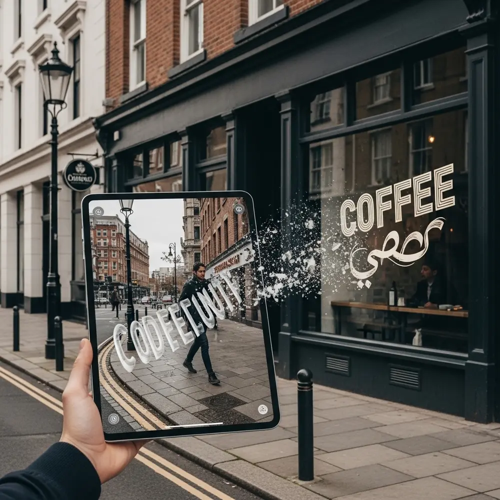
Beyond Screens: Spatial Typography in AR/VR
Virtual and augmented realities demand typography that exists in three dimensions. Designers in 2025 aren’t just choosing fonts; they’re engineering how letters occupy space. Shadows, textures, and depth become tactile tools—imagine typography that looks carved into stone or floating in smoke. AR apps overlay directional text on city streets with simulated perspective, while VR interfaces place navigational cues physically “closer” for urgency.
Legibility challenges spawn innovations: type subtly pulses in peripheral VR views, or dynamically shifts color against complex backgrounds. Emerging tools like SpatialType SDK allow real-time testing of font visibility across 360° environments, prioritizing functional beauty. This dimension of the Top Typography Trends in Graphic Design 2025 merges aesthetics with ergonomics, demanding designers think volumetrically.
Neo-Retro: Time-Traveling Typography with a Twist
Retro revivals persist, but 2025 reinterprets them through hybrid futurism. Designers fuse metrics from vintage styles—gritty 1970s slab serifs, 1980s neon outlines—with contemporary tech like generative algorithms. One viral campaign used 1920s-inspired lettering that progressively “decayed” digitally as users interacted with it, symbolizing digital ephemerality. The result pays homage without imitation, leveraging nostalgia to make novel concepts approachable.
Deco Revival illustrates this beautifully: structured geometry grounded in Art Deco principles, but with parametric flourishes algorithmically generated for each usage—ensuring no two logos are identical. Such synthesis honors history while rejecting replication, resonating with audiences craving both comfort and novelty. Institutions frequently tap into these contemporary design trends to modernize identity without alienating traditional stakeholders.
Eco-Conscious Typography: Designing with Ink & Intent
Sustainability infiltrates type design pragmatically and philosophically. Eco-fonts optimize ink usage by removing micro-dots from characters—popularized typefaces like Ryman Eco save up to 33% ink without visible compromise. Simultaneously, “regenerative typography” emerges: fonts bundled with carbon-offset contributions per license sale, like EarthType’s reforestation commitments. This aligns with the growing prioritization of sustainability among the Top Typography Trends in Graphic Design 2025.
Aesthetic minimalism complements this—uncoated paper stocks demand simpler, bolder fonts to avoid misprints, reducing waste. But it’s not just utility; it’s ethos. Campaigns proudly highlight eco-font usage as ethical proof points. How many trees will your next brand campaign save? That asterisk in the footnote might just become your strongest selling point.
Expressive Overlays: Typography as Collage
Layering text has transformed from taboo to tactic. Designers now deliberately crash type elements—mixing serifs with sans-serifs, overlapping headlines with body text—to generate dynamism and depth. Transparent gradients allow letters to intersect meaningfully, like words embedded within photographic textures. This controlled chaos thrives on screens where motion clarifies relationships: overlapping letters might animate apart on hover, revealing hidden interactions.
Context defines intent. Publications layer pull-quotes over full-bleed imagery to create immersive narratives, while e-commerce sites use overlapping type clusters to highlight complementary products. The key lies in balancing contrast and cohesion—sufficient visual tension to excite, but clear hierarchy to guide. This dimension of the Top Typography Trends in Graphic Design 2025 demands meticulous prototyping for intuitive legibility. For inspiration, explore dynamic overlays in our design portfolio, where serifs dance with illustrations across digital canvases.
Kinetic Typography Choreography: Text with Rhythm
Static type? Increasingly quaint. Motion design embeds typography into temporal storytelling, syncing rhythm with content. Consider text that flickers like a neon sign narrating noir fiction, or aspirational slogans dissolving like morning mist as users scroll. 2025 elevates this with AI-driven kinetic systems: algorithms adjust text animation speed based on user engagement metrics, pacing emotional arcs for impact.
Micro-interactions showcase brilliance—notification badges animating numbers like slot machines, or subtitles pulsing gently to speaker cadence. What’s changed? Sophisticated tools like FontMove automate complex animation curating, turning once-prohibitive techniques into workflow standards. If your message isn’t moving will your audience? Embrace motion not as embellishment but as narrative.
Cultural Hybridity in Type Design
Globalization births typographic fusion. Designers embed cultural motifs—Arabic calligraphy curves within Latin geometric sans-serifs or Kanji strokes influencing Cyrillic letter structures. Google’s Noto fonts exemplify this, covering thousands of languages with uniform harmony, but 2025 pushes toward stylistic interplay rather than mere coexistence. Multinational campaigns increasingly commission blended fonts that represent integrated brand localization strategies.
The challenge is avoiding appropriation. Ethical designers collaborate with cultural consultants—like Nairobi’s Type Foundry pairing Kenyan tribal artisans with font engineers to create commercially viable yet respectful hybrids. Such work doesn’t just look good; it celebrates linguistic diversity while expanding market resonance, creating fonts that are both functional artworks and diplomatic bridges.
Conclusion: Typography as Emotional Architecture
The Top Typography Trends in Graphic Design 2025 reveal a discipline transcending utility to become experiential architecture. Whether through kinetic rhythm, spatial depth, or sustainable ethics, typography shapes not just what we read but how we feel. As variable fonts, AR integration, and handcrafted imperfections blurlines between tradition and innovation, designers wield unprecedented expressive power.
Adaptability is key. No trend exists in isolation — retro flair may merge with eco-conscious fonts; kinetic type might operate within spatial dimensions. Brands mixing these strategies achieve distinctiveness: imagine layered AR lettering that animates responsively using variable-font technology, all rendered sustainably. Ultimately, 2025’s typography thrives on tension — human/tool, past/future, function/emotion — proving letters remain our most versatile visual storytellers.
Curious how these evolutions translate into tangible branding? Consider how professional design services reinterpret these typographic philosophies for market impact. Meanwhile, stay at the forefront by subscribing to our graphic design updates, or deepen technical mastery through our immersive typography masterclass.

