
7 Best Restaurant Menu Design Colors to Trigger Hunger
7 Best Restaurant Menu Design Colors to Trigger Hunger
In the highly competitive culinary landscape of the United Arab Emirates, the difference between a fully booked establishment and an empty dining room often lies in the subtle nuances of psychology. When we think about dining out, we usually focus on the taste of the food or the quality of service. However, professional restaurateurs and marketing experts understand that the visual experience begins long before the first bite is taken. The use of the 7 Best Restaurant Menu Design Colors to Trigger Hunger is a scientifically backed strategy used by the most successful Dubai businesses to influence consumer behavior and increase average check sizes. In a city where luxury and aesthetics are paramount, understanding how the human brain responds to specific wavelengths of light can give your establishment a significant competitive advantage.
The Abu Dhabi market, known for its mix of traditional hospitality and modern fine dining, has seen a shift toward more intentional design. Colors do more than just make a menu look attractive; they communicate the brand’s identity, set the mood, and—most importantly—stimulate the appetite. By strategically selecting a palette, Sharjah brands can evoke feelings of comfort, excitement, or urgency. Digital marketing in UAE has further emphasized the importance of these colors, as they must perform just as effectively on a smartphone screen for delivery apps as they do on a physical, leather-bound menu in a high-end bistro. This comprehensive guide explores how to leverage color psychology to ensure your menu is not just a list of items, but a powerful sales tool.
The Science of Color Psychology in the UAE Dining Scene
Color psychology is the study of how colors affect human behavior and decision-making. In the context of the food industry, certain colors can trigger physiological responses, such as increasing the heart rate or stimulating the production of saliva. For UAE companies operating in the hospitality sector, these triggers are essential for guiding guests toward high-margin items. When a customer opens a menu, their brain processes the visual information in milliseconds. If the colors are mismatched with the cuisine or the ambiance, it can lead to “cognitive dissonance,” where the customer feels an unconscious sense of unease, potentially leading to lower spending.
Artsun advertising agency specializes in bridging the gap between artistic vision and consumer psychology. By analyzing the 7 Best Restaurant Menu Design Colors to Trigger Hunger, we can see how different hues interact with the local culture and climate. In the heat of the UAE, cooling colors might seem appealing, but they often suppress the appetite. Conversely, warm tones that reflect the desert landscape can create a sense of belonging and hunger. Balancing these elements is key to creating a menu that resonates with both local residents and international tourists.
1. Red: The Ultimate Stimulant for Appetite
Red is widely considered the most effective color for stimulating hunger. It is a high-energy color that increases the heart rate and raises blood pressure, which in turn can lead to an increased desire to eat. This is why many of the world’s most famous fast-food chains and casual dining restaurants in Dubai use red as their primary branding color. In the context of the 7 Best Restaurant Menu Design Colors to Trigger Hunger, red stands out as a “buy now” signal. It creates a sense of urgency and passion, making food items look more flavorful and “hot.”
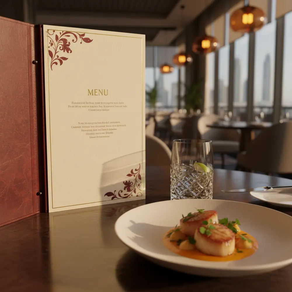
For fine dining establishments in the Abu Dhabi market, red should be used with more restraint. Instead of bright, aggressive reds, designers often opt for deep maroons, burgundies, or terracotta shades. These darker variations maintain the appetite-stimulating properties of red while adding an air of sophistication and luxury. When paired with high-quality food photography, red accents can make a steak look juicier or a spicy dish appear more authentic. It is a color that demands attention and is perfect for highlighting “Chef’s Specials” or signature dishes that you want your guests to notice immediately.
2. Yellow: Creating a Sense of Happiness and Speed
Yellow is the color of sunshine, optimism, and happiness. In the brain, yellow is associated with the release of serotonin, a chemical that makes us feel good. When customers are happy, they are more likely to enjoy their dining experience and spend more freely. In the list of 7 Best Restaurant Menu Design Colors to Trigger Hunger, yellow plays a crucial role in making a restaurant feel welcoming and friendly. It is particularly effective for breakfast spots, cafes, and fast-casual eateries that want to promote a fast-paced yet cheerful environment.
However, yellow must be used carefully. Too much bright yellow can be overstimulating and may even lead to feelings of anxiety if the customer stays too long. This is why it is often used in “grab-and-go” establishments where high turnover is desired. For a more relaxed dining atmosphere, pale yellows or ochre tones are preferred. To ensure your brand identity is cohesive across all platforms, integrating yellow into professional logo creation can help your restaurant stand out in the crowded digital marketing in UAE space, ensuring that your brand is the first thing customers think of when they want a quick and happy meal.
3. Orange: The Social and Friendly Appetizer
Orange is a unique blend of the energy of red and the cheerfulness of yellow. It is often described as a “social” color because it encourages conversation and interaction. In the UAE, where dining is frequently a communal and family-oriented activity, orange can be a powerful tool. It is known to increase oxygen supply to the brain, producing an invigorating effect and stimulating mental activity, which includes the desire to eat. It is one of the 7 Best Restaurant Menu Design Colors to Trigger Hunger because it makes people feel comfortable and uninhibited.
Orange is frequently associated with healthy options like citrus fruits and pumpkins, but it also carries a sense of affordability and value. If you are a Sharjah brand looking to position your restaurant as a place for everyone, orange is an excellent choice. It works exceptionally well on physical menus when used as a background color for sections featuring appetizers or sharing platters. To maximize the impact of this vibrant hue, many owners invest in expert menu design services to ensure the balance between the color and the typography is perfect, preventing the menu from looking cluttered or overwhelming.
4. Green: The Symbol of Freshness and Health
As the global and local trend moves toward health-conscious eating, green has become an essential part of the 7 Best Restaurant Menu Design Colors to Trigger Hunger. Green is instinctively associated with nature, growth, and freshness. For Dubai businesses that focus on organic, vegan, or farm-to-table concepts, green is the primary color of choice. It signals to the customer that the food is high-quality, safe, and nutritious. Unlike red, green does not create a sense of urgency; instead, it encourages guests to linger and enjoy their meal in a relaxed environment.
In the Abu Dhabi market, where sustainability is becoming a key focus for UAE companies, using green on a menu can enhance the brand’s reputation as an ethical choice. Darker forest greens can evoke a sense of tradition and prestige, while lighter lime greens are perfect for juice bars and trendy brunch spots. When incorporating green into your menu, it is vital to pair it with natural textures and images. High-quality visuals from professional advertising photo shoots can showcase the vibrant colors of fresh vegetables, making the green elements on the menu feel even more authentic and appetizing.
5. Brown: Reliability and Earthy Comfort
Brown is often overlooked, but it is one of the most stable and reliable colors in the designer’s palette. It represents the earth, wood, and stone, evoking a sense of heritage and artisanal quality. In the 7 Best Restaurant Menu Design Colors to Trigger Hunger, brown is used to ground the more vibrant colors and provide a sense of warmth. It is highly effective for steakhouses, coffee shops, and bakeries. Brown suggests that the food is wholesome, handmade, and prepared with care—values that are highly appreciated by Sharjah brands and their customers.
Using brown as a secondary color or as the material for the menu itself (such as kraft paper or leather) can create a tactile experience that complements the visual one. It communicates a “back to basics” approach that can be very refreshing in a high-tech city like Dubai. When customers see brown, they often think of chocolate, coffee, or perfectly grilled meat, all of which are powerful hunger triggers. To see how these earthy tones can be integrated into a broader brand strategy, you can explore the comprehensive marketing agency solutions that help restaurants build a consistent look and feel across all touchpoints.
6. Black and Gold: The Peak of Luxury and Excellence
While not traditionally “hunger-triggering” in a physiological sense, black and gold are essential for the high-end UAE dining market. These colors trigger a different kind of hunger: the hunger for status, luxury, and an elite experience. Black provides a high-contrast background that makes other colors, especially the colors of the food, pop. Gold accents suggest exclusivity and high quality. In the context of the 7 Best Restaurant Menu Design Colors to Trigger Hunger, these colors are used to justify premium pricing and to signal that the meal is an “event” rather than just a necessity.
Many fine-dining establishments in Dubai use black menus with gold foil lettering to create a sense of mystery and sophistication. This color scheme works best when the restaurant focuses on the “experience” of dining. Artsun advertising agency has helped numerous clients implement these regal tones to attract a discerning clientele. When a customer sees a beautifully designed black and gold menu, they expect the highest level of culinary artistry. This psychological positioning allows the restaurant to lead the customer toward signature dishes that are both profitable and prestigious.
7. Turquoise and Teal: The Modern Twist for Coastal Dining
In a region surrounded by the beautiful waters of the Arabian Gulf, turquoise and teal have emerged as popular choices for seafood restaurants and beachfront lounges. While blue is traditionally known as an appetite suppressant, lighter and warmer shades like turquoise can be quite inviting. These colors evoke the freshness of the sea and the coolness of a breeze, making them perfect for the 7 Best Restaurant Menu Design Colors to Trigger Hunger in a coastal context. They provide a unique alternative to the standard reds and yellows, allowing a brand to differentiate itself in the competitive Dubai businesses sector.
Turquoise is often associated with cleanliness and health, which is vital for seafood establishments where freshness is the top priority for guests. When used as an accent color against a clean white or sandy beige background, it creates a Mediterranean or tropical feel that encourages guests to relax and order another round of appetizers or drinks. For UAE companies looking to innovate, turquoise offers a modern, trendy vibe that appeals to a younger, Instagram-savvy demographic. Combining these colors with a well-thought-out Artsun advertising agency strategy can ensure your restaurant becomes a visual landmark in the digital space.
Implementing Color Strategy for Maximum ROI
Choosing the right colors is only the first step. The implementation of the 7 Best Restaurant Menu Design Colors to Trigger Hunger requires a deep understanding of layout, typography, and lighting. A color that looks great on a computer screen might look dull under the warm yellow lights of a romantic restaurant. Furthermore, the cultural context of the UAE must be considered. Certain colors may have specific religious or traditional meanings that could influence how they are perceived by local guests. It is always best to work with experts who understand the local landscape and can provide a nuanced approach to design.
Successful restaurant owners in Abu Dhabi and Sharjah know that their menu is a living document. It should be tested and refined based on customer feedback and sales data. Are people ignoring your high-margin items? Perhaps they are placed on a color background that doesn’t trigger enough interest. Are guests rushing through their meals? Maybe your color palette is too high-energy. By constantly analyzing the performance of your menu and your overall digital marketing in UAE, you can make data-driven decisions that lead to sustainable growth and a loyal customer base.
Frequently Asked Questions
What is the best color for a fast-food menu in Dubai?
Red and yellow remain the top choices for fast-food menus in Dubai. This combination, often called the “Ketchup and Mustard” theory, creates a sense of speed, happiness, and intense hunger, which is perfect for high-turnover environments where customers want quick and delicious meals.
Can I use blue on my restaurant menu?
Blue is generally considered an appetite suppressant because it rarely occurs naturally in food. However, it can be used successfully in the UAE for seafood restaurants or as a cooling accent color in cafes to create a relaxed, airy atmosphere. The key is to use it sparingly and in the right shade, such as turquoise.
How do I choose colors for a high-end menu in Abu Dhabi?
For the luxury Abu Dhabi market, focus on deep, rich tones like burgundy, forest green, or navy blue, paired with metallic accents like gold or silver. These colors communicate prestige and quality, which helps justify the higher price points associated with fine dining.
Should my menu colors match my restaurant’s interior?
Yes, consistency is vital. Your menu is an extension of your brand. If your interior uses earthy tones and natural wood, a neon-colored menu will feel out of place. Ensuring a match between your 7 Best Restaurant Menu Design Colors to Trigger Hunger and your physical space creates a cohesive and professional experience for your guests.
How often should I update my menu’s design?
It is recommended to review your menu design every 12 to 18 months. Trends in the UAE food scene change rapidly, and what worked two years ago might feel dated now. Regular updates allow you to refresh your color palette and stay relevant to the evolving tastes of Dubai and Sharjah diners.
Conclusion: Crafting a Visual Feast
Mastering the 7 Best Restaurant Menu Design Colors to Trigger Hunger is both an art and a science. By understanding the psychological impact of red, yellow, orange, green, brown, black, and turquoise, you can create a menu that does more than just list your food—it actively sells it. In the vibrant markets of Dubai, Abu Dhabi, and Sharjah, where every detail matters, your menu serves as a silent salesperson that can significantly influence your restaurant’s success. Whether you are a small startup or one of the established UAE companies, investing in professional design and color strategy is a proven way to enhance the dining experience and boost your bottom line.
Ready to transform your menu into a high-converting marketing tool? Let the experts help you navigate the complexities of visual psychology and local market trends. Contact a professional creative partner today to start building a brand that tastes as good as it looks. Your journey to becoming a top-tier dining destination in the UAE begins with a single, colorful choice.


Leave a Reply
Want to join the discussion?Feel free to contribute!